FlipTix.
I helped move FlipTix from a basic startup product toward a ticketing experience that felt clearer, more modern and easier to trust.
Buy the ticket. Enjoy the event. Flip the time you do not use.
Overview
FlipTix explored a different take on ticketing: last-minute inventory for buyers, with the ability to flip the remaining time at an event for rewards or cash. The design challenge was making an unusual model feel simple enough to trust.
Making the product feel credible.
The brand needed to feel fresh without looking lightweight. The identity was simplified around the ticket form, orange accent and a small set of recognisable product cues.
A startup ticketing product needed to look trustworthy before people would put money through it.
Identity · iconography · mobile visual systemLearn about the user without making them work for it.
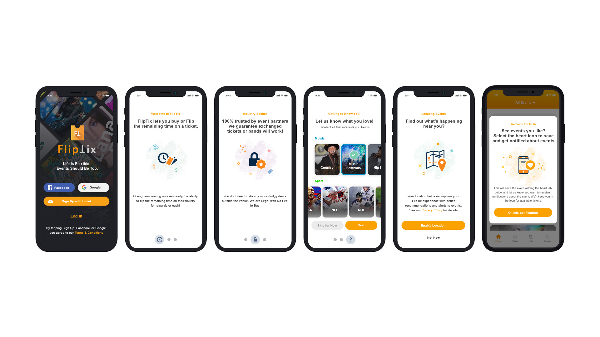
Onboarding combined product education with lightweight preference gathering, helping users understand the model while improving future recommendations and notifications.
Keep the buying flow boring in the best way.
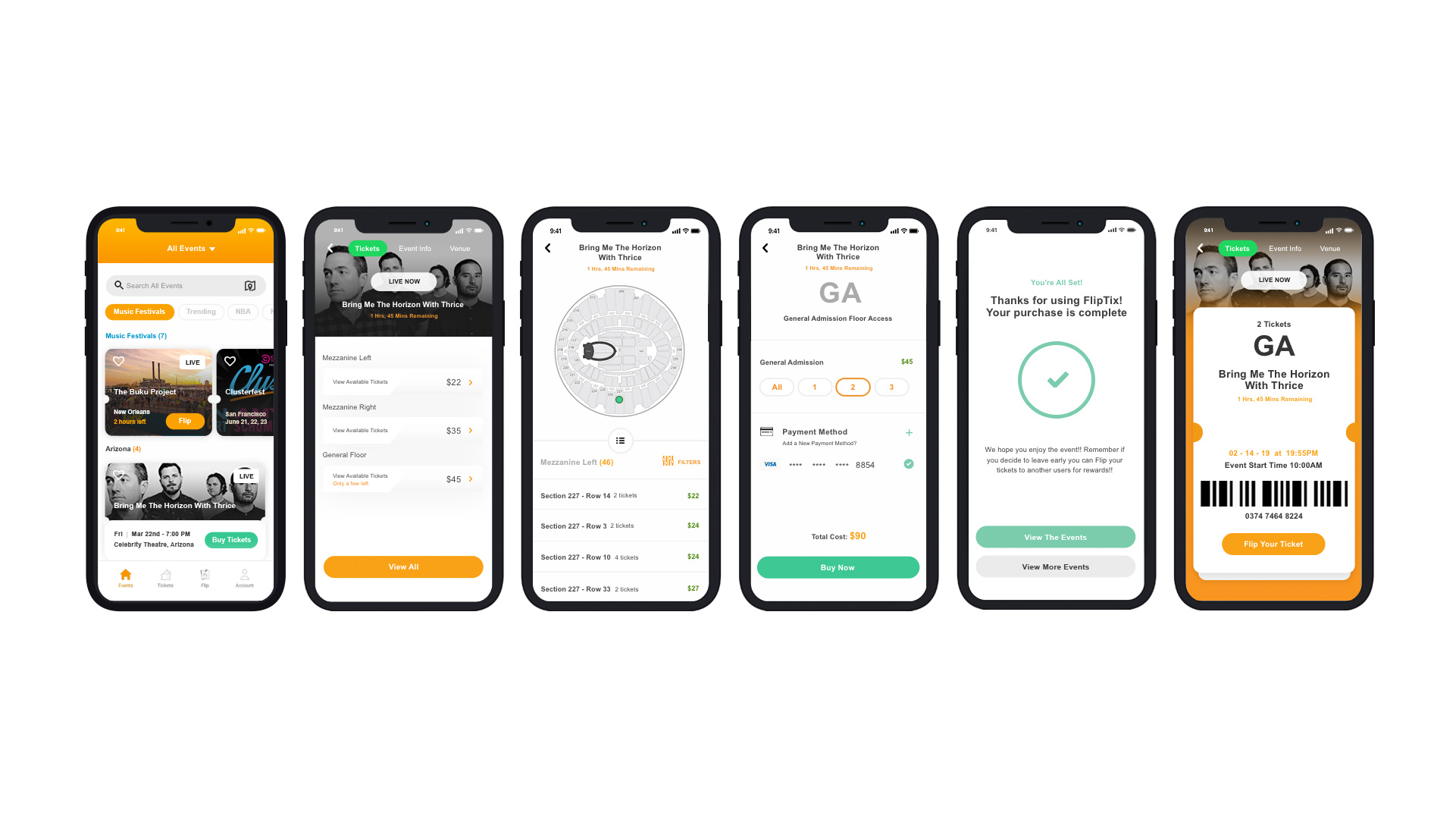
Discovery could be expressive. Purchase needed to be predictable. The flow kept event choice, seats, payment and confirmation moving in one obvious direction.
Flip it.
The product became interesting when the ticket stopped being static. Leave early and the unused portion could become something valuable again.
The unusual mechanic had to feel as straightforward as buying the ticket in the first place.
Select the ticket, verify it, confirm the exit, then choose the reward.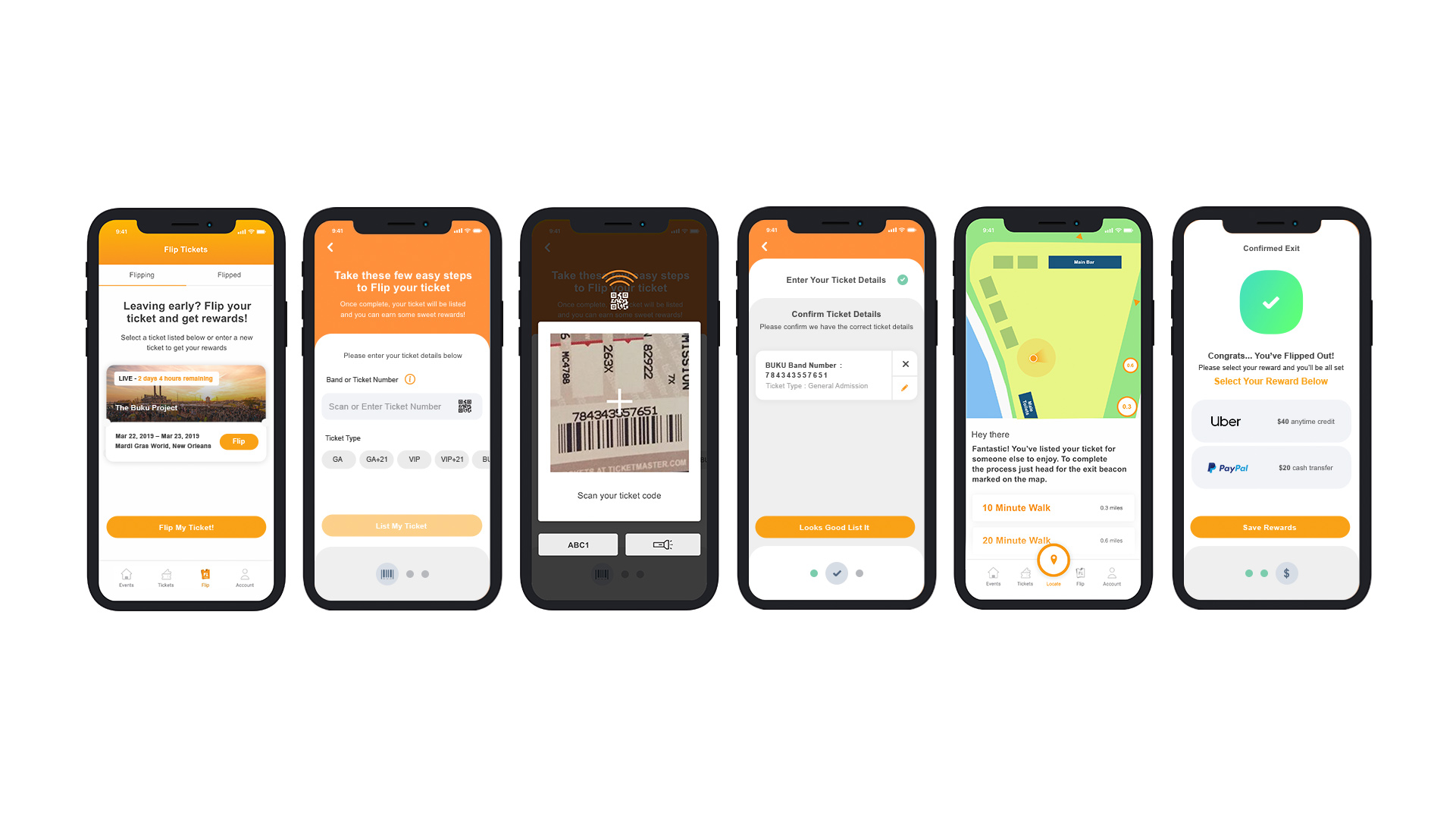
The interesting part was not making another ticketing app. It was making an unfamiliar ticketing idea feel obvious enough to use.