Feral Kitty
Club.
Identity, apparel and campaign direction for a streetwear label rooted in Los Angeles skate culture and built around one permanently unimpressed cat.
Good cats.
Bad habits.
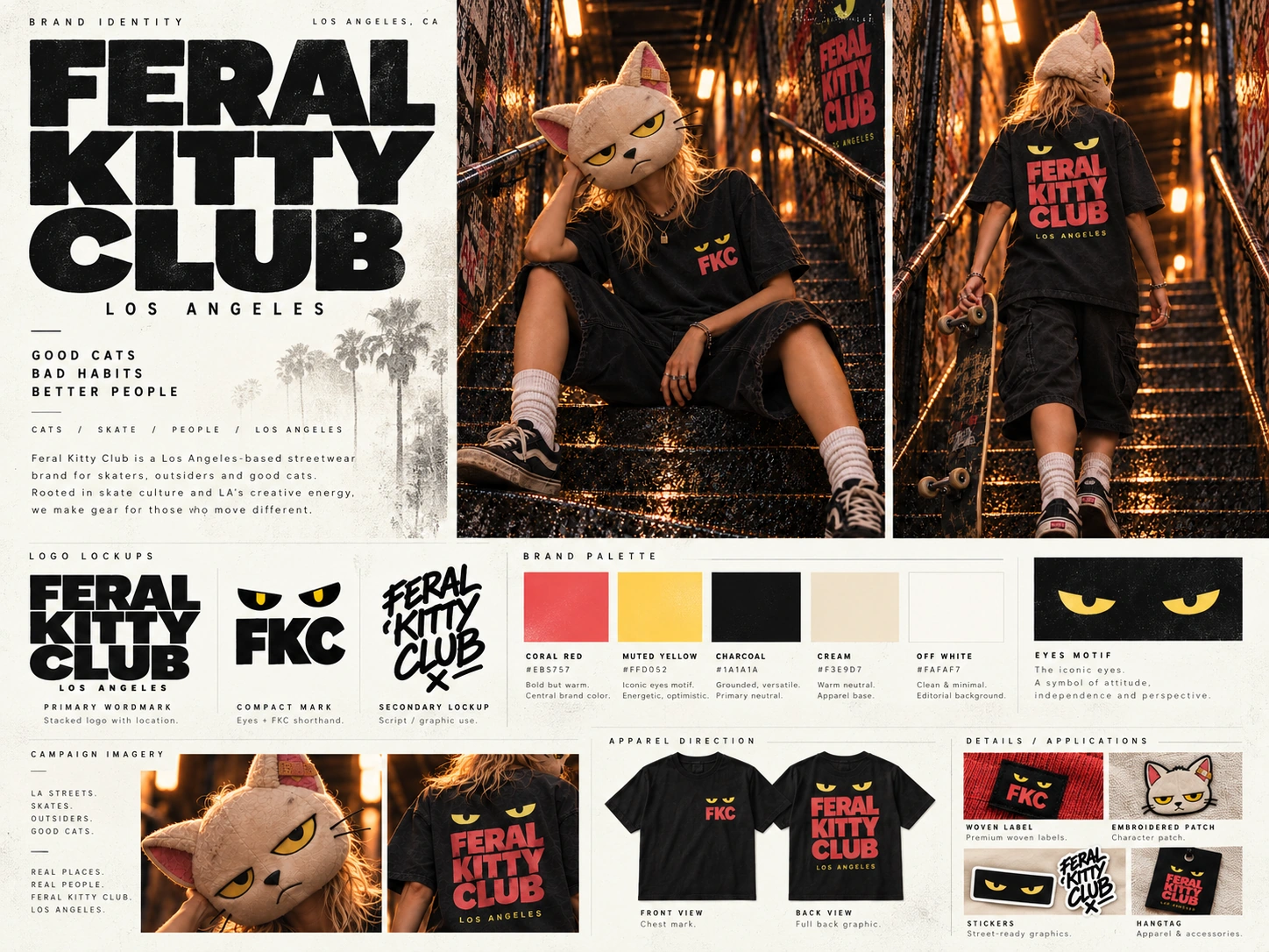
Feral Kitty Club is streetwear with a dry sense of humour and a recognisable face. The identity takes cues from skate graphics, band merchandise, stickers and the visual noise of Los Angeles without turning into a pastiche of any one scene.
The aim was to make the brand feel established from the start. A small set of marks, a tight palette and a character strong enough to carry a campaign give FKC enough consistency to move between apparel, labels, graphics and photography.
One face.
A few ways to wear it.
The eyes are the quickest read. Paired with FKC they become a compact chest mark, label and sticker. The full name handles larger applications, while the cat shaped marks give the system more personality when it needs it. Coral, yellow, charcoal and cream keep everything recognisable without making the system too precious.
The cat takes the lead.
Rather than build the campaign around a conventional fashion model, the FKC mask becomes the recurring face of the label. The expression never changes. The clothes, streets and people around it do.
Not a logo.
A presence.
The mask turns the mascot into something physical. Cream fabric, yellow eyes, a flat expression and the bandaged ear make it immediately recognisable without feeling like a polished mascot costume. It can be worn, carried, photographed or simply appear in the background.
The character gives the label a point of view without ever needing a named founder or spokesperson. It can belong to whoever is wearing it.
Graphics that can move.
The identity is designed to work at different volumes. Some pieces carry only the eyes and FKC. Others let a graphic take over the garment. That gives the brand room for quieter staples, seasonal colour and louder illustration without losing the thread.
Made to travel.
The graphic system extends beyond clothing into stickers and small street-level applications. The same eyes, mascot and loose lettering can work as a complete pack or break apart into marks that feel at home in the visual noise of the city.
A warmer drop.
Same attitude.
The identity also holds up away from the darker core pieces. This red tee keeps the yellow eyes and front chest mark, then lets the loose script lockup take over on the back. Same character, brighter energy, still unmistakably FKC.
The brand leaves a mark.
Los Angeles sits behind the brand rather than on top of it. Stickers, skate culture, colour, walls and everyday street texture give FKC a sense of place without turning the city into a costume.
Worn.
Stuck.
Everywhere.
The strongest applications are the ones that feel like they were always meant to be there.
Behind the scenes, after hours and out in the world.
A simple identity becomes stronger when it has somewhere to live. For FKC, the marks, clothes, character and photography all belong to the same street.