KILTR.
My first startup taught me what happens when product, brand, community and culture all grow at the same time.
A new place for Scotland to share ideas, culture and creative work.
Overview
KILTR began as a media-sharing platform in Scotland during a period of intense public debate around the independence referendum. The product gave people a place to publish, discover and discuss content outside traditional media, while the brand grew into events, screenings, art, food and nightlife.
Give good content room to breathe.
The feed was designed around visual impact. Profiles, images, articles and events could sit together without collapsing into one repetitive social-card format.
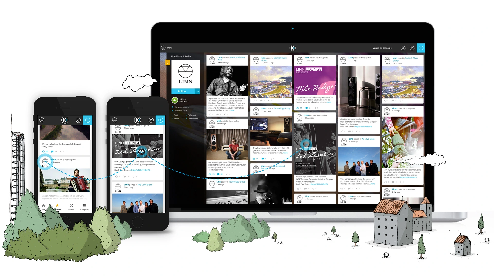
The aim was simple: let the quality of what people published feel visible immediately.
Responsive feed · profiles · visual storytelling · events · discoveryPublish something worth looking at.
This was before mobile apps dominated every social product. KILTR treated responsive web as the main canvas, giving people a straightforward way to create more expressive, blog-like posts that still worked everywhere.
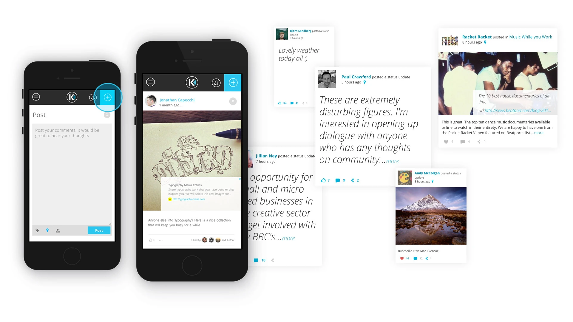
Text, image or link without a complicated editor.
Different content types could take on more visual character.
Responsive output kept the post useful across devices.
A social product with its own visual character.
The wider system had to connect profiles, feeds, editorial content, events and promotional material without losing the personality that made KILTR recognisable.
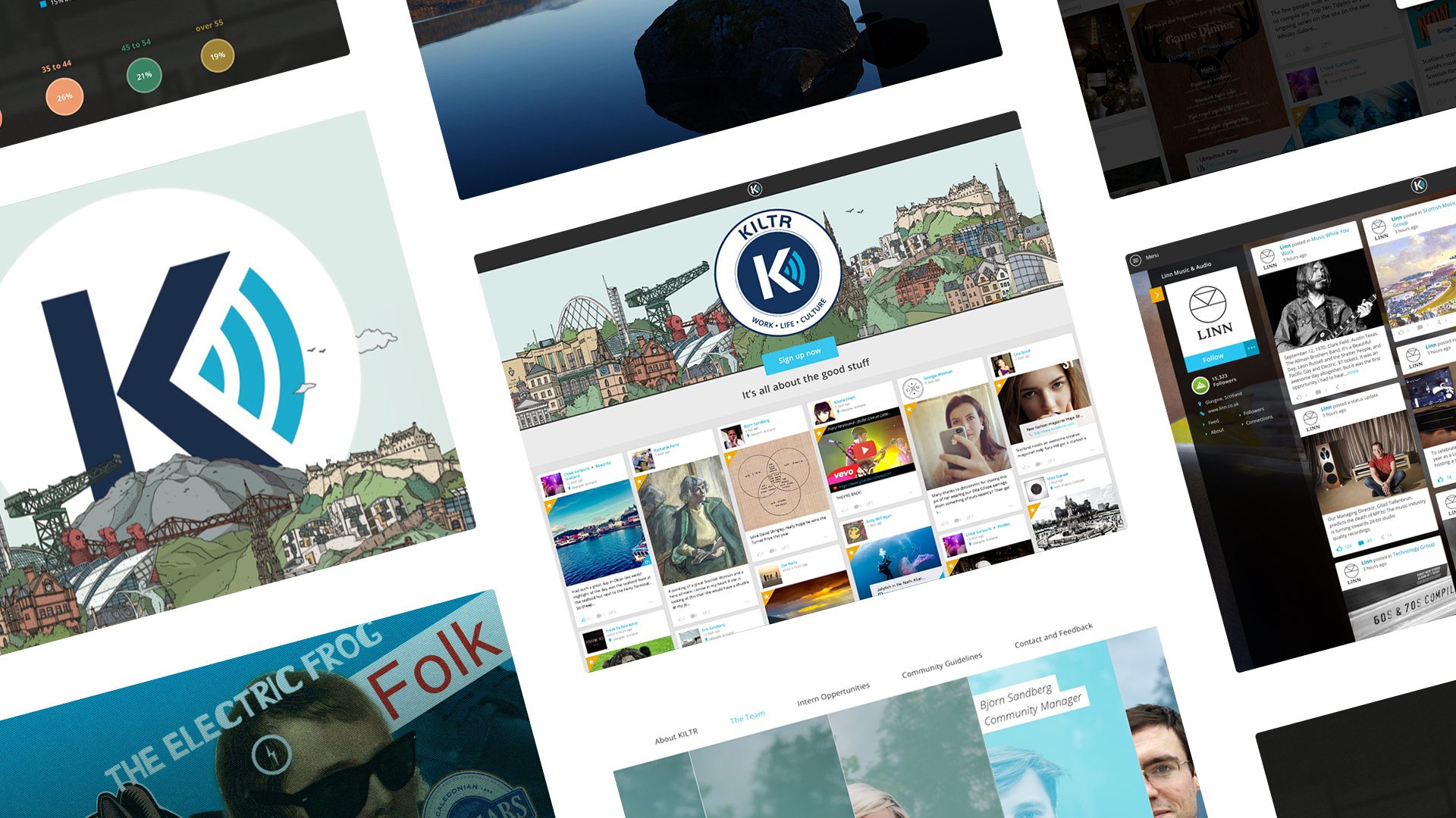
The same identity had to work across a social feed, profile pages, editorial experiences, promotional campaigns and the physical events growing around the platform.
KILTR in motion.
A short look at the product and brand in use, adding some movement and context between the interface system and the wider community work.
The brand left the browser.
KILTR became much more than a product interface. We created referendum debates, screenings, digital art events, club nights and food festivals, using design as a way to give the community a visible presence in the real world.

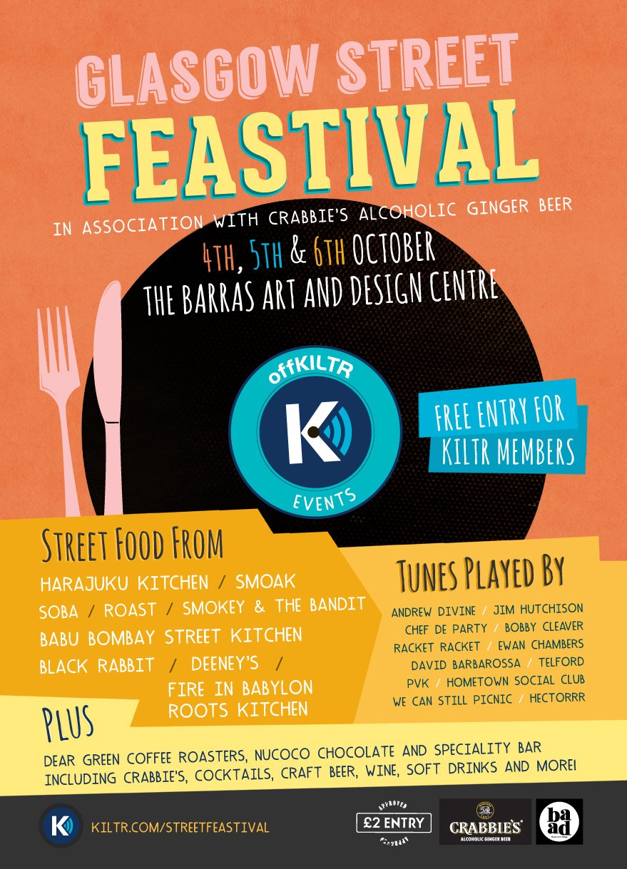
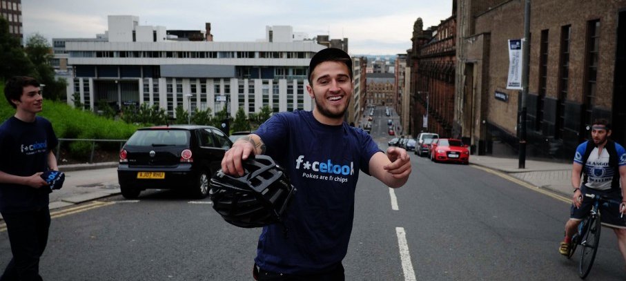
Brand was not a layer added after the product. It was how the product, community and events all felt connected to the same idea.
KILTR was where I first learned how much design changes inside a startup. You are not polishing one product. You are helping the whole thing discover what it is.