ZestCoin.
ZestCoin needed to move from a playful crypto identity to something that could explain a serious idea: using blockchain mechanics to support charitable giving.

From crypto mascot to a more credible blockchain brand.
Overview
The team approached me to rethink the brand, website and wider digital presence. The concept combined cryptocurrency with charitable giving, including token burns and a share of trading fees directed toward community projects. The design needed to make that mission feel understandable and trustworthy.
Keep the energy. Lose the mascot.
The original identity centred on a lime wearing sunglasses. Through community workshops, the brand shifted toward an abstract block-based mark that referenced blockchain while keeping the bright colour palette recognisable.
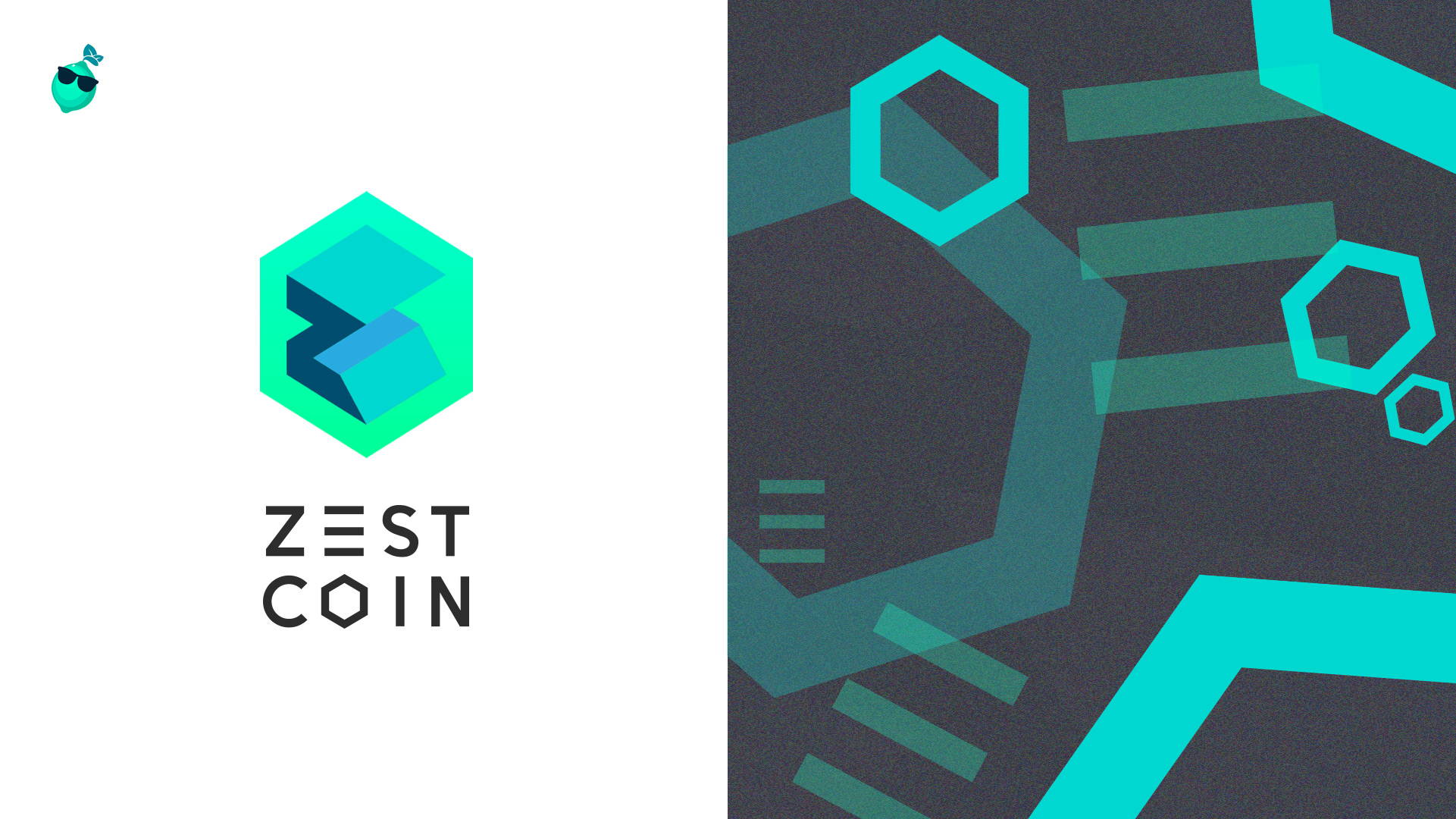
More credible without becoming generic.
The new system retained the bright, digital energy of the community but gave ZestCoin a visual language that could work across technology, charity and investor conversations.Playful lime mascot and fragmented social presence.
Geometric mark, cohesive palette and scalable system.
Make a complicated idea easier to enter.
Crypto products can become dense very quickly. The site used strong hierarchy, visual milestones and simple navigation to make the mission, token mechanics and roadmap easier to follow.
The website needed to look technical without feeling impenetrable.
Desktop and mobile shared the same content architecture, with the interface adapting rather than simply shrinking.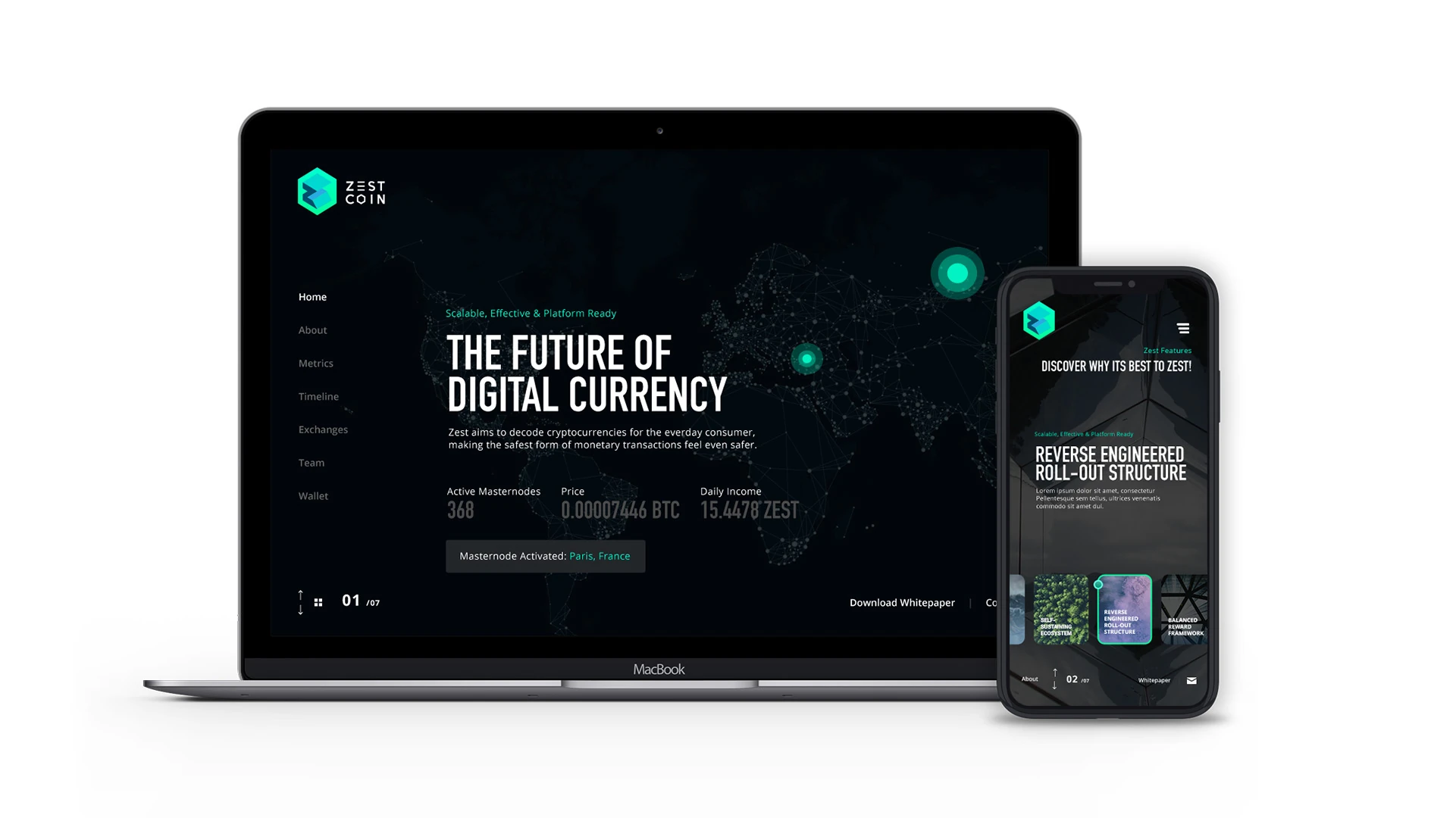
One story, compressed into a much smaller space.
The mobile experience carried the same hierarchy through token metrics, roadmap, exchange information and the core project narrative without turning into a wall of data.
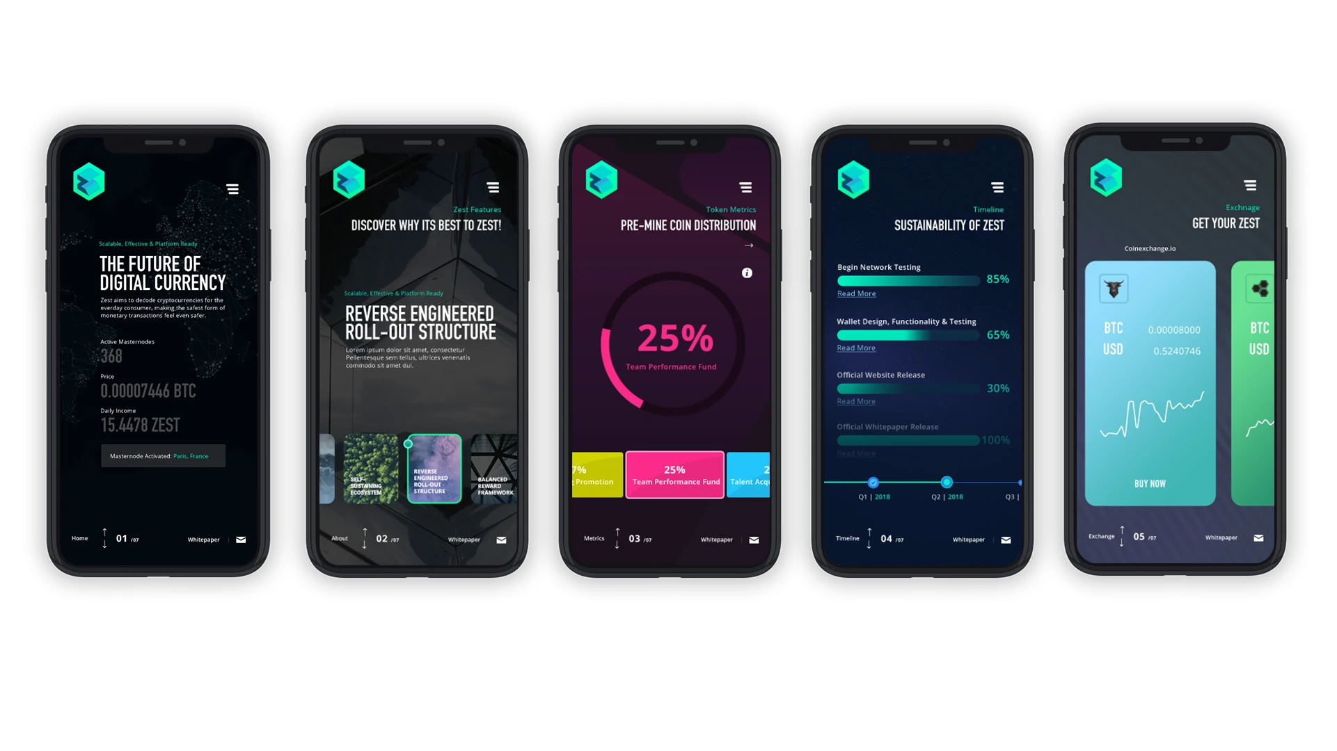
Each screen had a different job: establish the proposition, explain the project, show distribution and progress, then make exchange information actionable.
Extend the identity beyond the homepage.
The work expanded into presentations, promotional materials, platform downloads and the broader communications system used around the project.
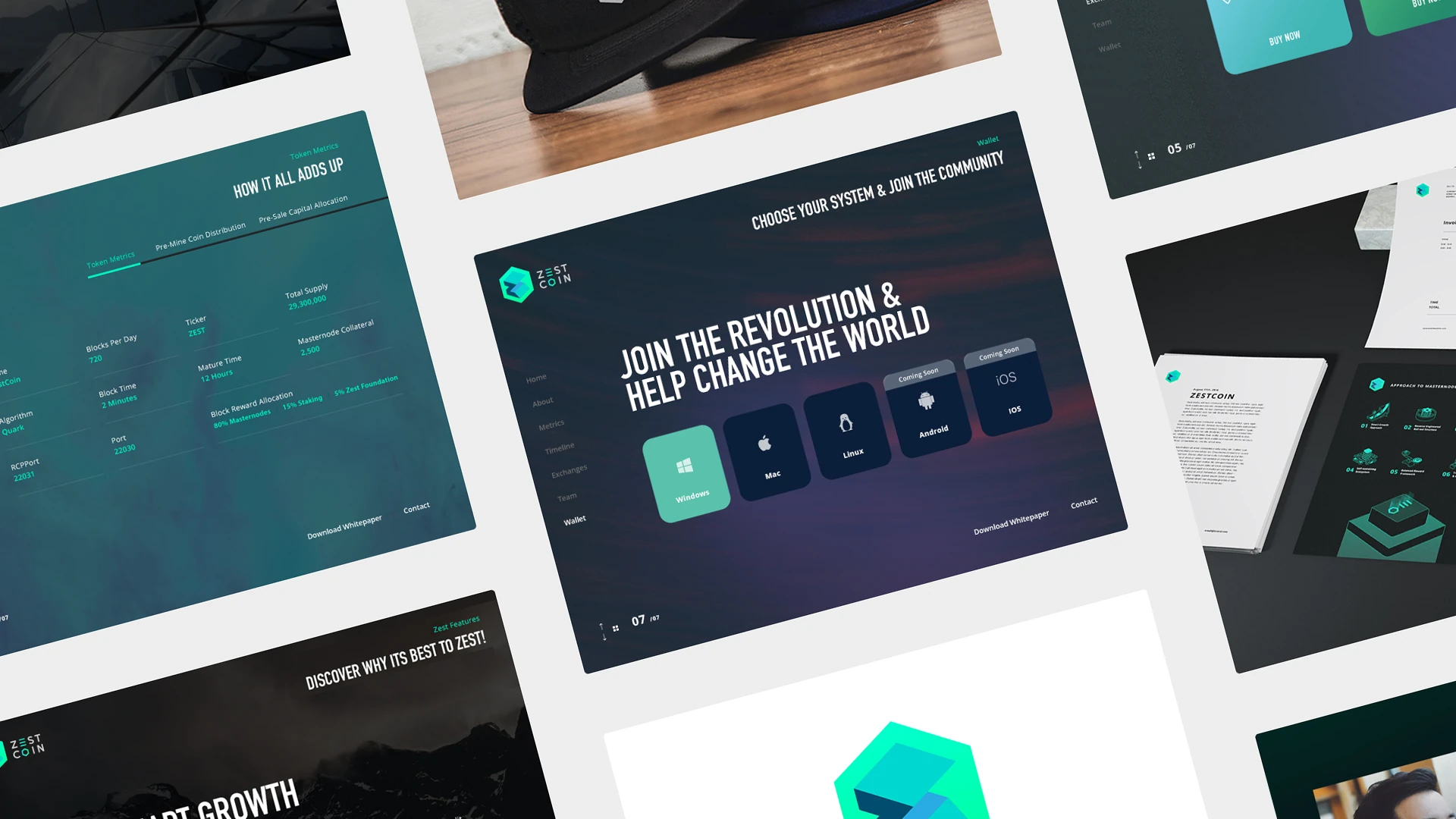
A crypto brand rarely lives in one place.
The same system had to hold together across social, technical information, community communications and physical events.Make the identity work in the real world too.
Roadshows and seminars were an important part of community growth, so the system extended naturally into apparel and simple branded objects rather than feeling like separate merchandise.
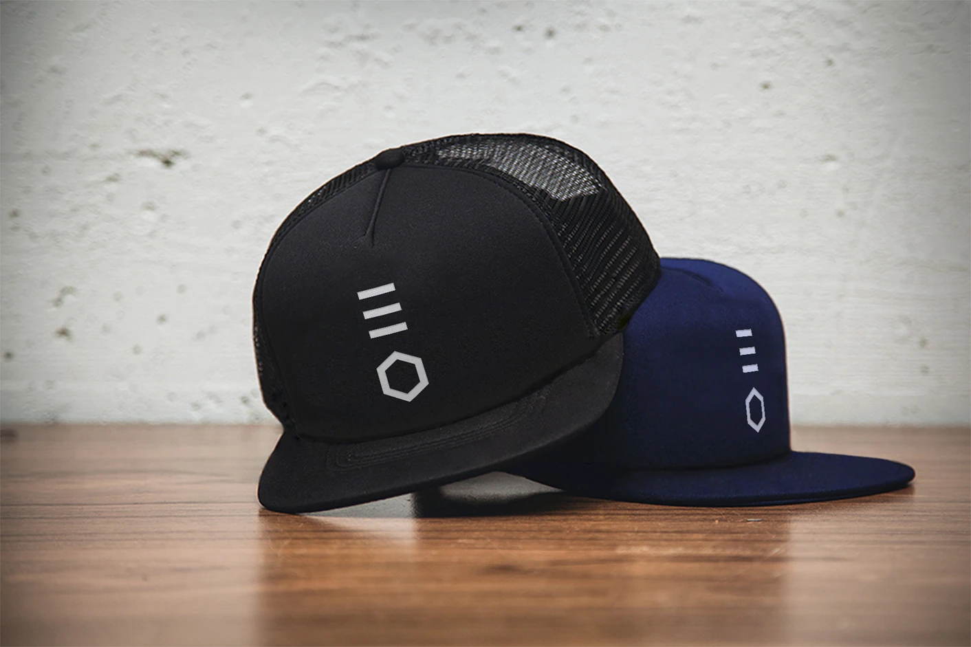
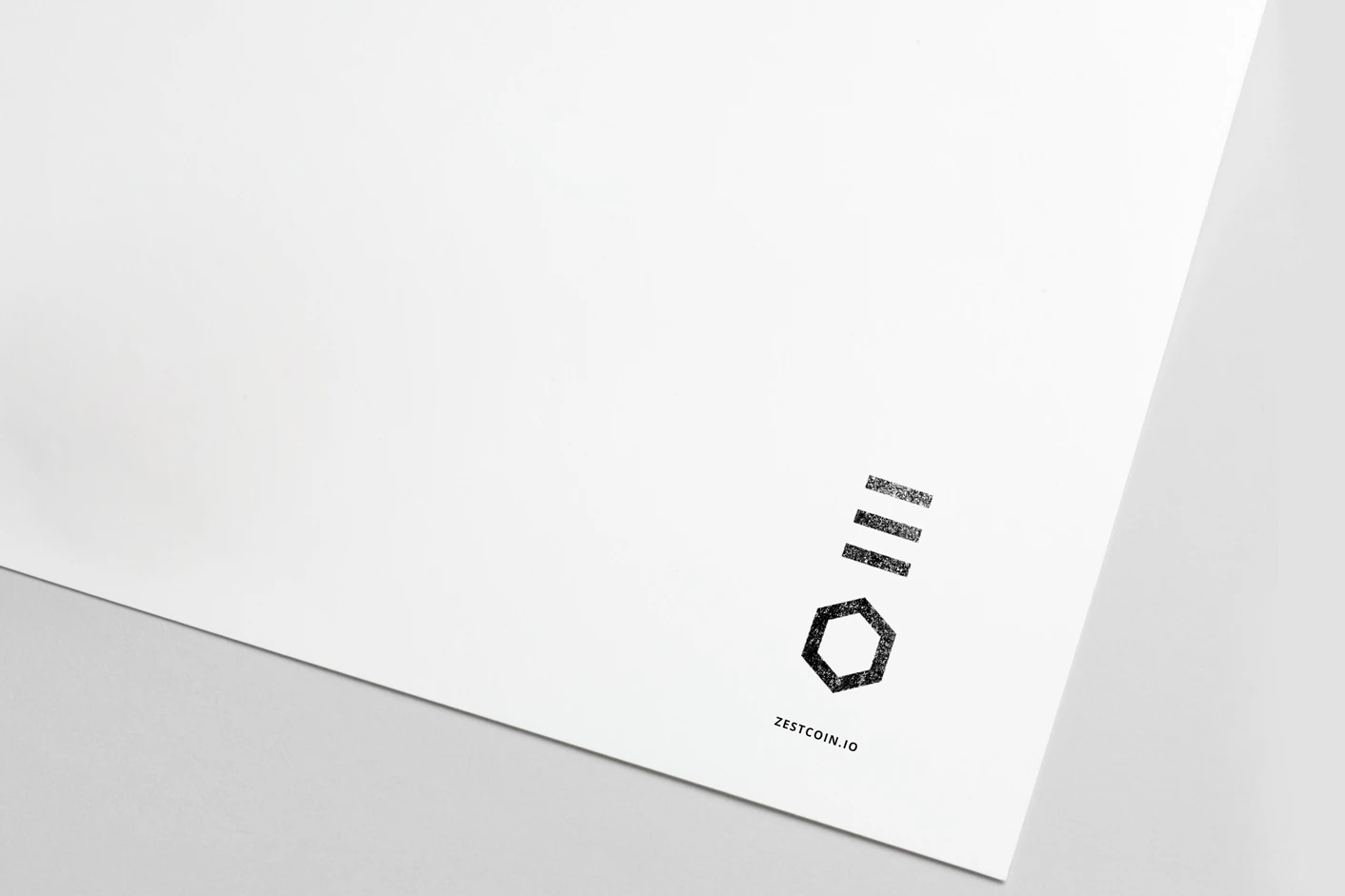
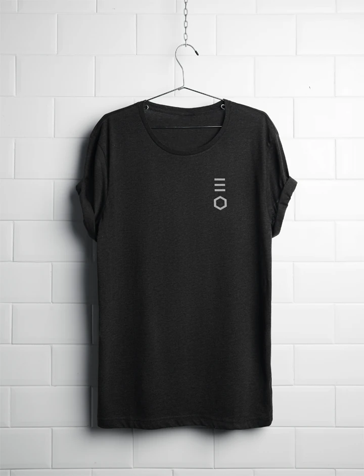
Whether somebody met ZestCoin on a phone, at a seminar or through a piece of printed material, it needed to feel like the same project.
The design problem was never simply “make crypto look futuristic.” It was making an unfamiliar financial idea feel more credible, understandable and coherent.